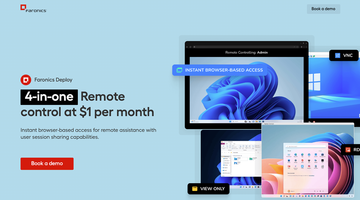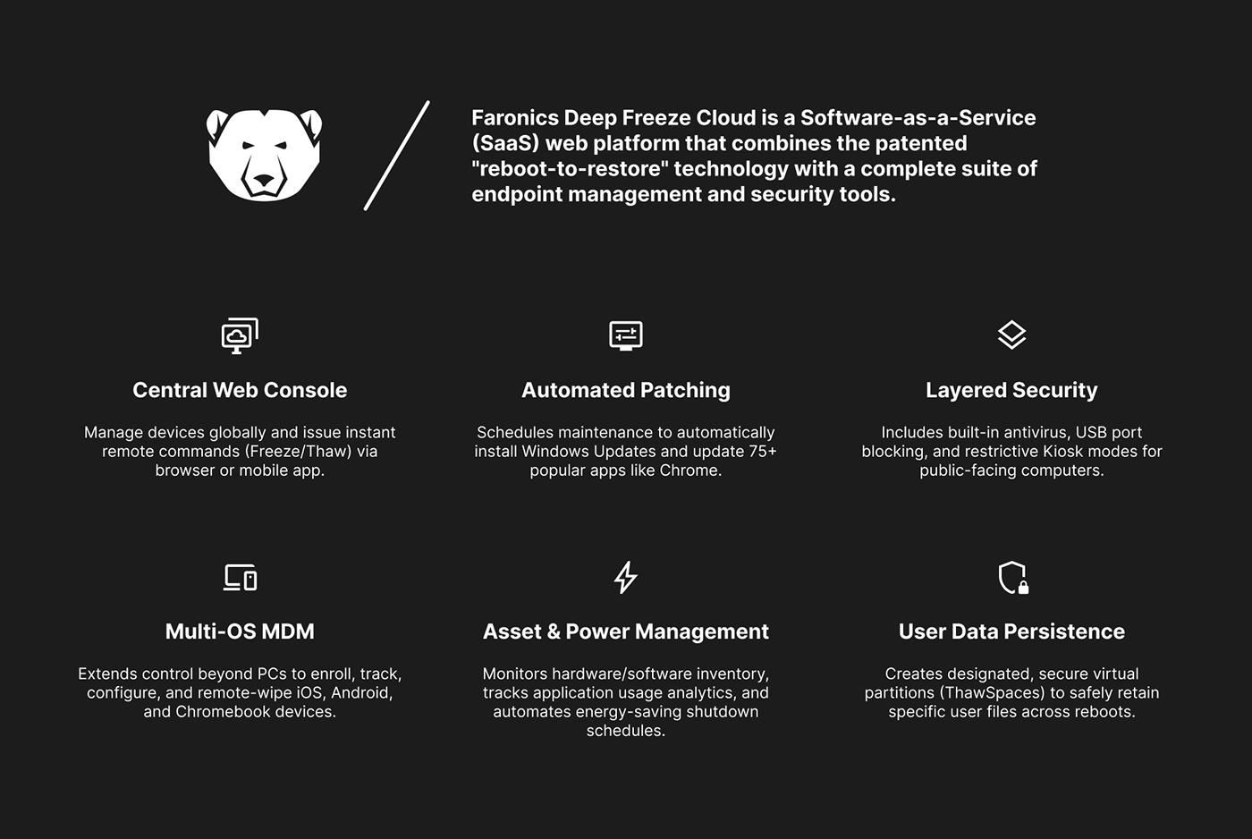
A polished, responsive webpage design showcasing modern layout techniques, strong typographic hierarchy, and thoughtful use of white space to create a premium digital presence.
The design focused on creating a clear visual journey for the visitor — leading the eye through the content using scale, contrast and strategic use of negative space.
The layout grid was designed to be completely fluid, adapting gracefully from ultra-wide desktop down to mobile without requiring breakpoint-specific redesigns. The component system was documented in a Figma library for seamless handoff.

View the Full Case Study
Explore the complete process, research, wireframes, and final designs on Behance.